UI enhancements
Changed
- Improved recommendation impact charts
-
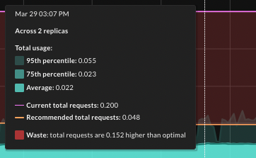
Shading for Usage now includes the 95th and 75th percentile total usage in addition to average total usage.
-
Shading for Net impact more clearly explains the “gap” between current and recommended requests settings.
-
Chart tooltips on the Impact tab now include Waste (overprovisioning) or Performance risk (underprovisioning) details, as shown below.
-
Last modified June 27, 2024