Test Run Latency Distribution
3 minute read
After you have finished a test run, you can review the test run details to check for failed requests, checks/asserts and the overall response times. If you want to drill down in the response times you can use the Latency Distribution view.
Locating the Latency Distribution

- Navigate to the test run details page
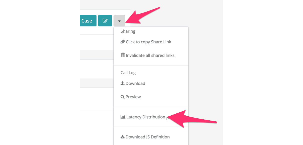
- Click on the context drop down icon on the top right next to the Edit button
- Click Latency Distribution
Components
Let’s go through each component on the Latency Distribution page.
Filtering

First is the filter that by default shows all data for the whole test run. The filter itself is collapsed - clicking it anywhere shows all available configurable filter criteria:
- Request Tag - Each request can have one tag. Use this to filter only on a selected set of tags, e.g. to observe only the requests related to the product details page.
- Status Code - Use this to filter for certain response codes, e.g. to see only the failed requests.
- Time Range - This allows to check only a specific phase, e.g. in a spike test only the spike phase is of interest.
- Max Latency Bucket - By default we only show buckets with latencies up to the 95th percentile. You can increase this, if you are interested in buckets up to the 99th or 99.9th percentile.
- Logarithmetic scale for Graph - Enable to see change the scale on the Latency Histogram to logarithmic.
Change the filter criteria as needed and click “Submit Query” to refresh the selected data.
Note
Note: The latency heatmap below also allows further drilldown into specific time ranges (minimum 5 minutes).Graph: Latency Heatmap

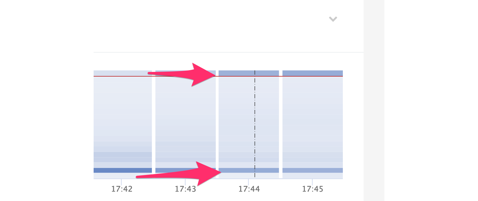
Below the filter is a heatmap over the selected time range. The x-axis contains one bar for each full minute of the test run while the y-axis shows the latency buckets (up to the configured Max Latency Bucket).
The more requests have the same minute / latency bucket the darker the color gets. Buckets with no requests are shown white. A vertical dashed black line indicates a new arrival phase.
You can click and drag on the heatmap to zoom into a 5 minutes time range. The Reset Zoom in top right allows resetting the time range. The latency histogram below will be automatically adjusted to the selected time range. Clicking shift allows to drag the time range to left and right.

Example: The screenshot shows two darker spots for the 17:44 minute. Since one dark spot is at the top of the bar this represents a very high latency. Using the filters (request tags, success/failure codes) we can find the request that observes these high latency. In this example the error page (5xx) has a higher latency than the successful response due to running into timeouts and other problems.
Graph: Latency Histogram

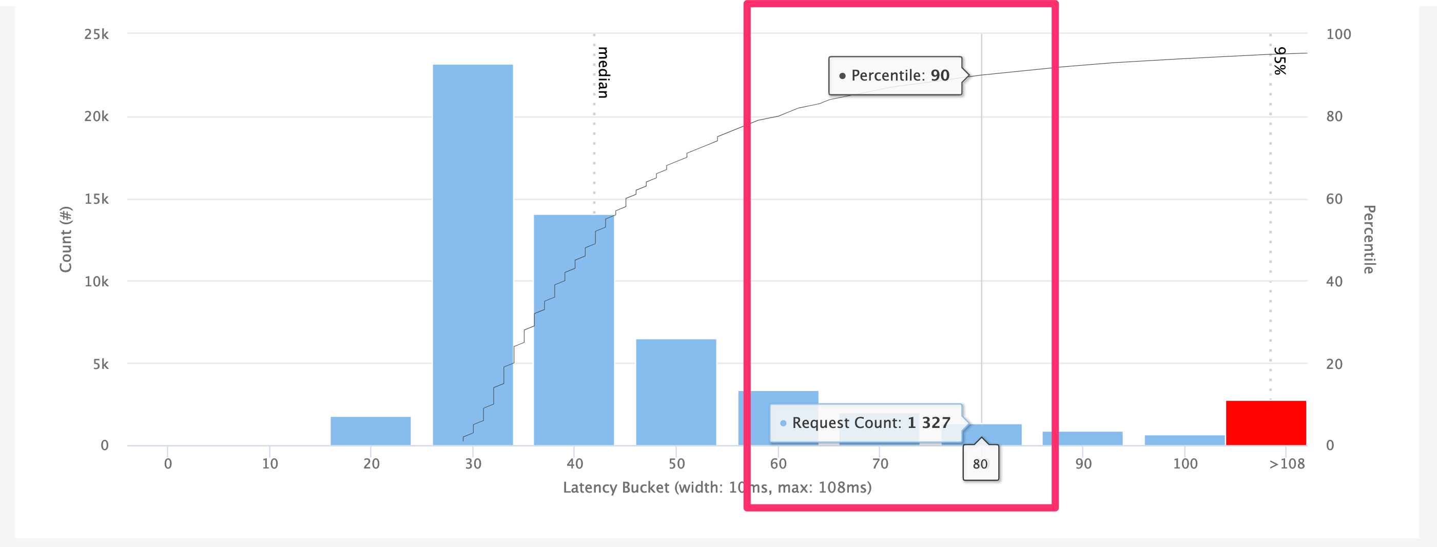
The next graph shows all selected requests as a histogram. The x-axis shows the buckets from zero to the configured Max Latency Bucket in the filters. The y-axis shows the count of requests that fall into each bucket.
Any responses over the configured Max Latency Bucket are grouped into the last bucket, which is shown in red.
A dotted black line indicate the median, 95%, 99% and 99.9% percentiles. The latter two are only visible if the configured Max Latency Bucket is high enough.
A thin solid black line indicates all percentiles. Hovering over it with the mouse shows how many requests finished within a certain time window and what percentile this is.

Example: This screenshot shows the mouse hovering at the 90th percentile mark on the solid black line. The vertical line shows that this percentile is in the 80 to 90 millisecond bucket.
Summary Table

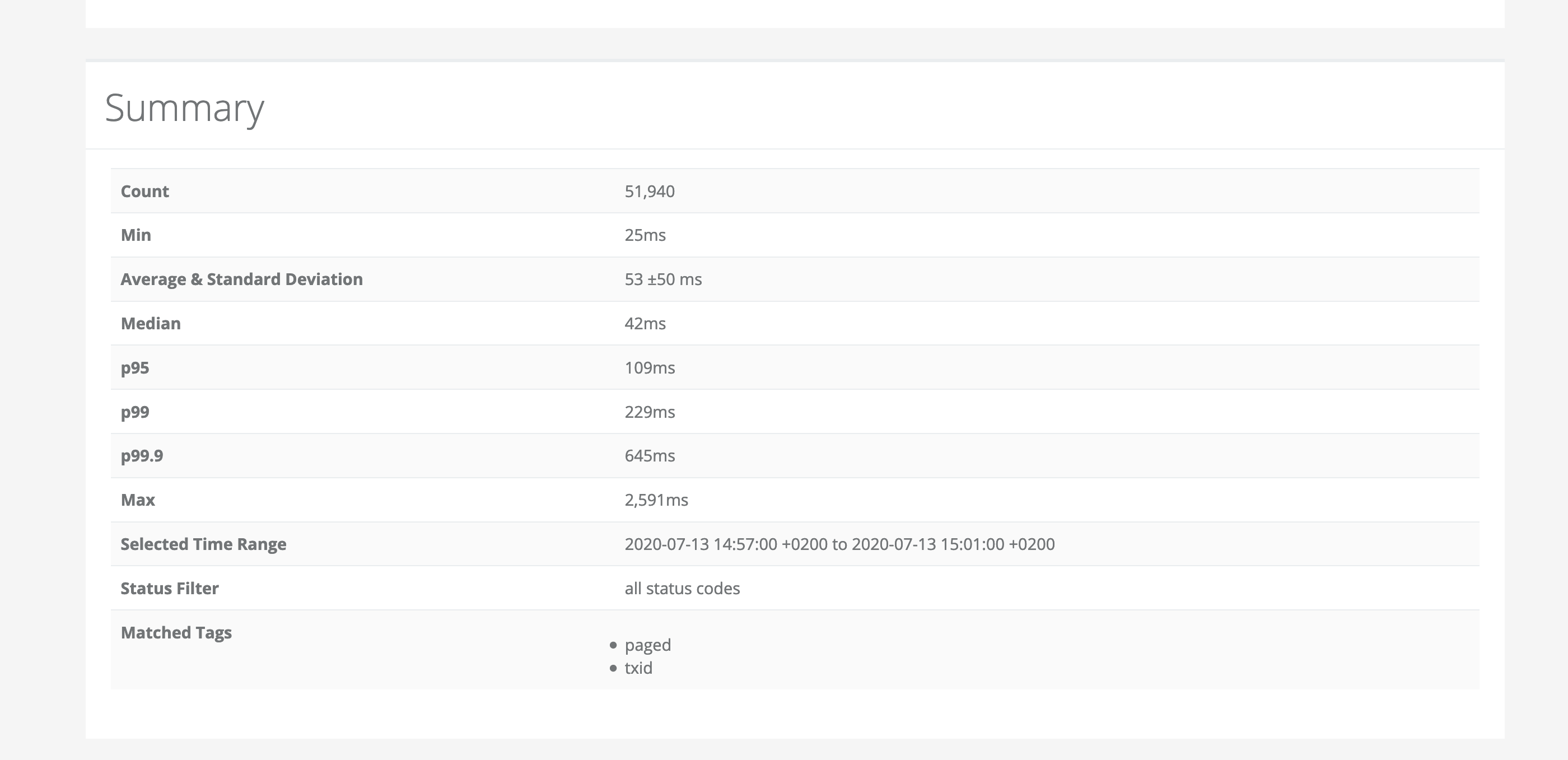
The last component on the page is the summary table. It restates various latencies (min, max, p99 etc.).